
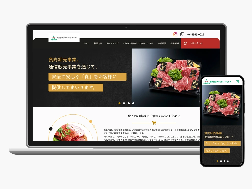
Client: Asmo Trading Co., Ltd.
Role: Lead Web UI/UX Designer (Sole Designer)
Tools: Figma, Photoshop CC, stakeholder feedback
Scope: Full Website Redesign, Visual Refresh, UX Improvements
Deliverables: Responsive Website Design (Desktop & Mobile)
Redesigning the corporate website for a Japanese meat wholesaler to improve clarity, trust, and mobile usability.
The project involved modernizing Asmo Trading Co., Ltd.’s website, a B2B food wholesaler based in Japan. The primary goals were:
As the sole designer, I led the project end-to-end—from stakeholder discussions and wireframing to high-fidelity UI design and developer collaboration—delivering a user-centered and visually engaging experience aligned with the company’s values of quality and transparency.
Stakeholder Interviews
Spoke with company management and marketing to understand their customers’ priorities: transparency (origin, safety), product quality, and timely information (news, notifications).
Heuristic Audit
Reviewed the existing website to identify usability issues: dense text blocks, small fonts, and navigation that mixes multiple sections.
Competitive & Benchmark Analysis
Analyzed other food sourcing and import-export company websites in Japan and internationally to see how they present product origin, safety information, and contact/order processes.
I created low-fidelity wireframes for the homepage, business pages, and contact page, to name a few, exploring content hierarchy, navigation models, and user flows.
The focus was on making key information—product origin, quality statements, and latest news—immediately accessible to both domestic and international users.

Homepage

Business Overview
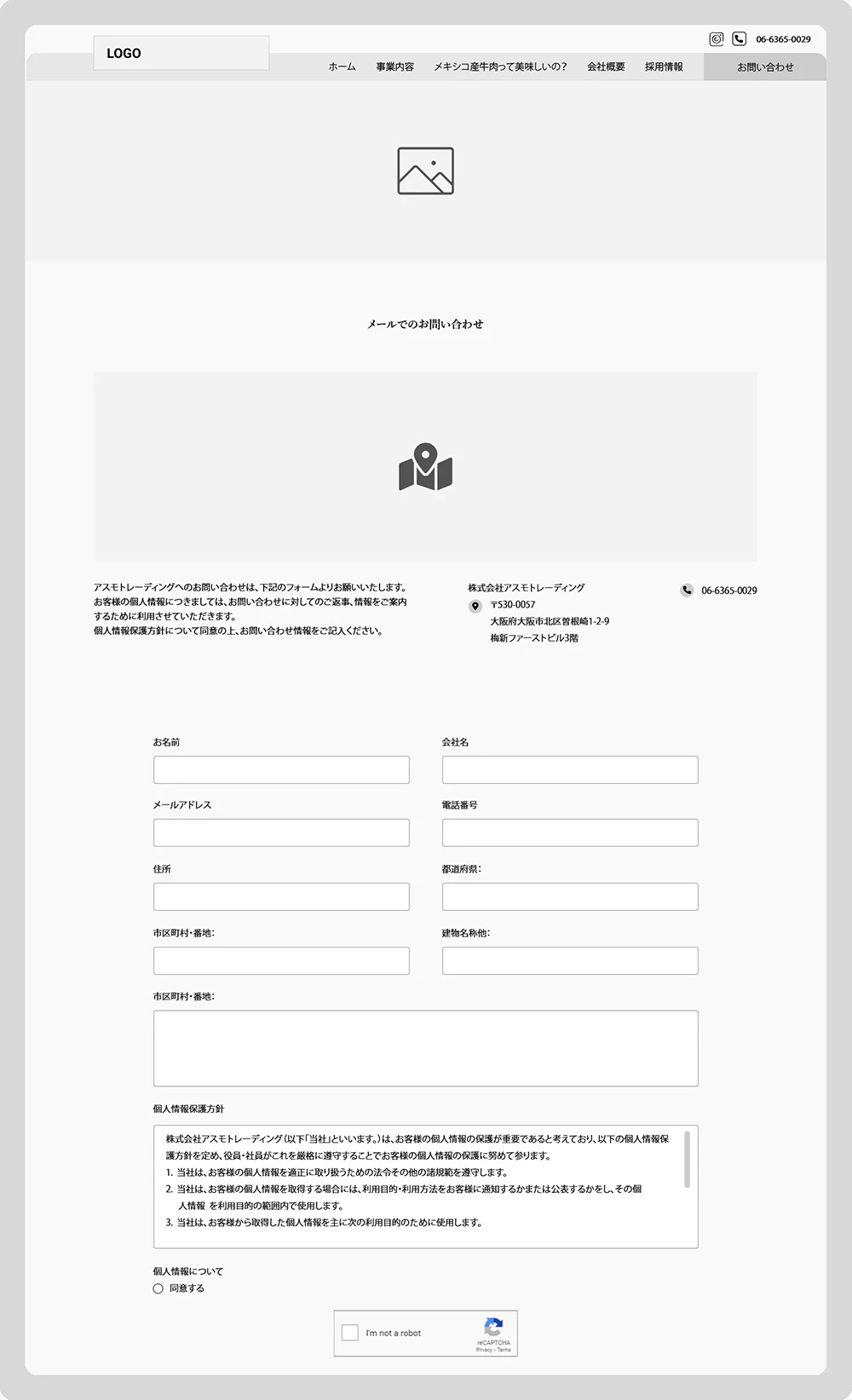
Contact
Wireframes demonstrating page structure and navigation planning.
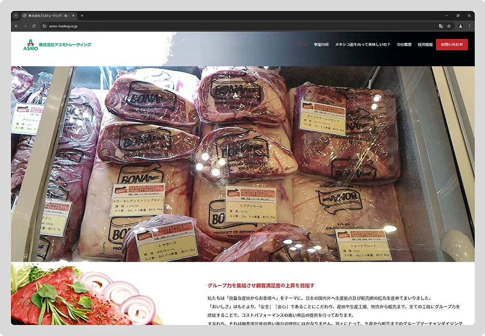

High-fidelity screens for key pages translated wireframes into clear, visually engaging layouts, reinforcing trust, quality, and readability across devices.
High-fidelity screens demonstrate a modernized brand identity and clear visual hierarchy across key pages, including the homepage, business pages, and contact page.
Visual Design Focus:

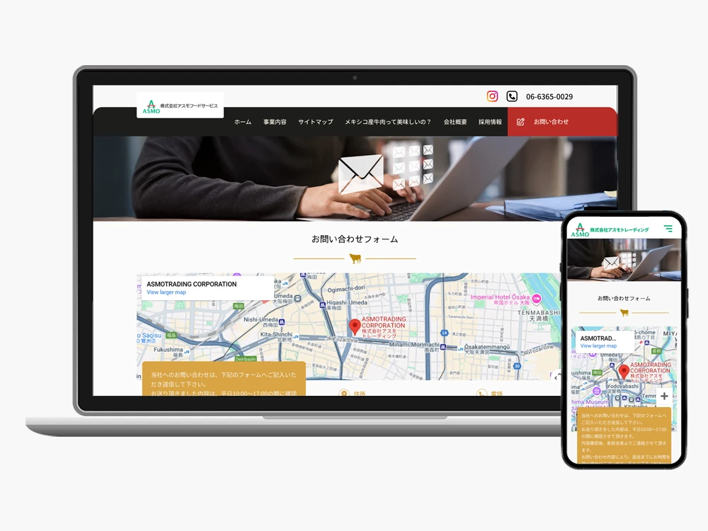
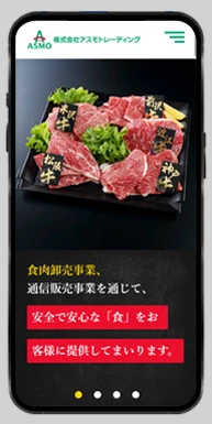
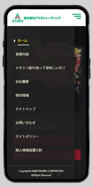
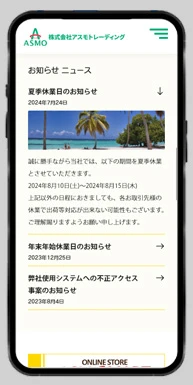
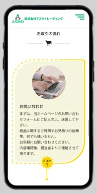
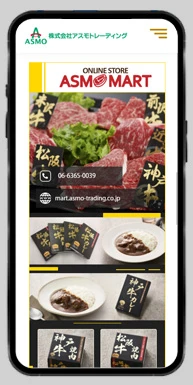
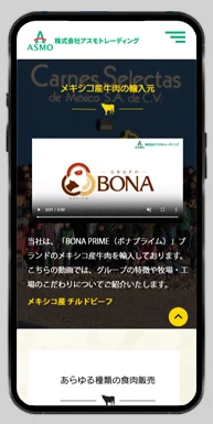
These design choices created a credible, high-quality look and feel while improving usability and engagement.
Although formal, large-scale UX research (surveys, usability labs) wasn’t feasible, all design decisions were grounded in stakeholder interviews, heuristic evaluation, and benchmarking.
The redesign delivered a website that feels modern, trustworthy, and easier to navigate—especially for new visitors or potential partners.
Through clearer interaction flows (exploring sourcing info, contact forms, product details) and refined visual hierarchy, both usability and visual clarity improved.
This project reinforced my ability to balance user experience and visual polish, managing a full design process independently. In future projects, I plan to integrate formal usability testing to validate design decisions further.
Workflow: Stakeholder discussions → Wireframing → High-fidelity design & prototyping → Developer handoff