
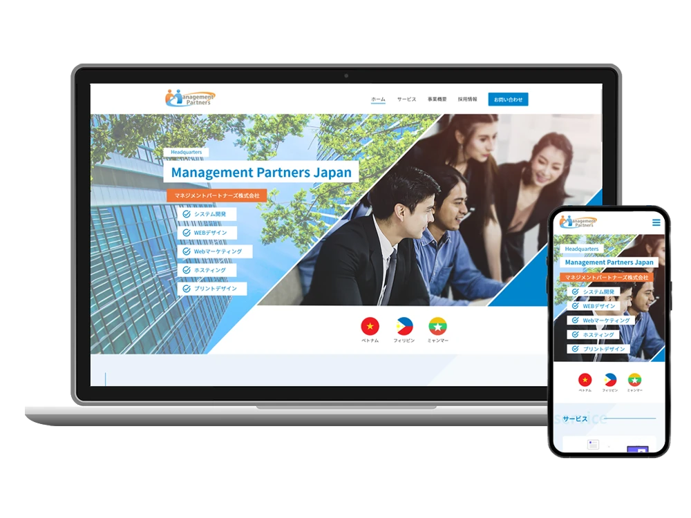
Client: Management Partners (Japan)
Role: Lead Web UI/UX Designer (Sole Designer)
Tools: Adobe XD, Photoshop, stakeholder feedback
Deliverables: Responsive Corporate Website Design (Desktop & Mobile)
I led the end-to-end redesign of Management Partners Japan’s corporate website, delivering a modern, responsive user experience that strengthened brand credibility and streamlined user navigation.
As the sole designer, I owned the full UX/UI process—from layout ideation to QA-ready high-fidelity mockups—while collaborating asynchronously with internal stakeholders.
The redesign focused on improving clarity, visual hierarchy, and user engagement, while guiding visitors toward high-priority actions like exploring services and submitting inquiries.
Content Mapping & Page Structuring
Mapped core content based on business priorities and user intent, laying the foundation for clear, intuitive navigation.
Wireframing & UI Design
Created low-fidelity wireframes for the homepage, recruitment page, and contact page, to name a few, exploring layout, content hierarchy, and user flows.
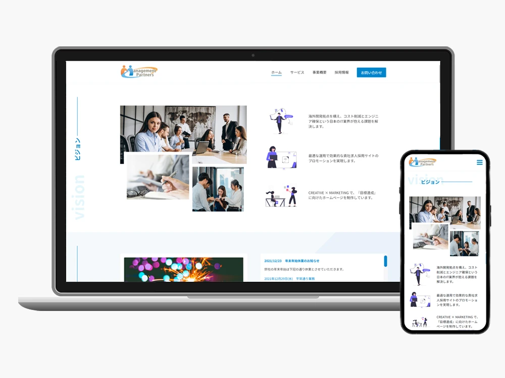
High-fidelity screens translated these wireframes into polished, responsive designs, ensuring clarity, visual consistency, and engaging interactions.
Asynchronous Stakeholder Collaboration
Shared updates through screen recordings and live prototypes to maintain momentum and quickly align feedback despite time zone differences.
Responsive Testing Across Breakpoints
Continuously tested and refined layouts for desktop, tablet, and mobile to ensure usability, readability, and visual consistency.
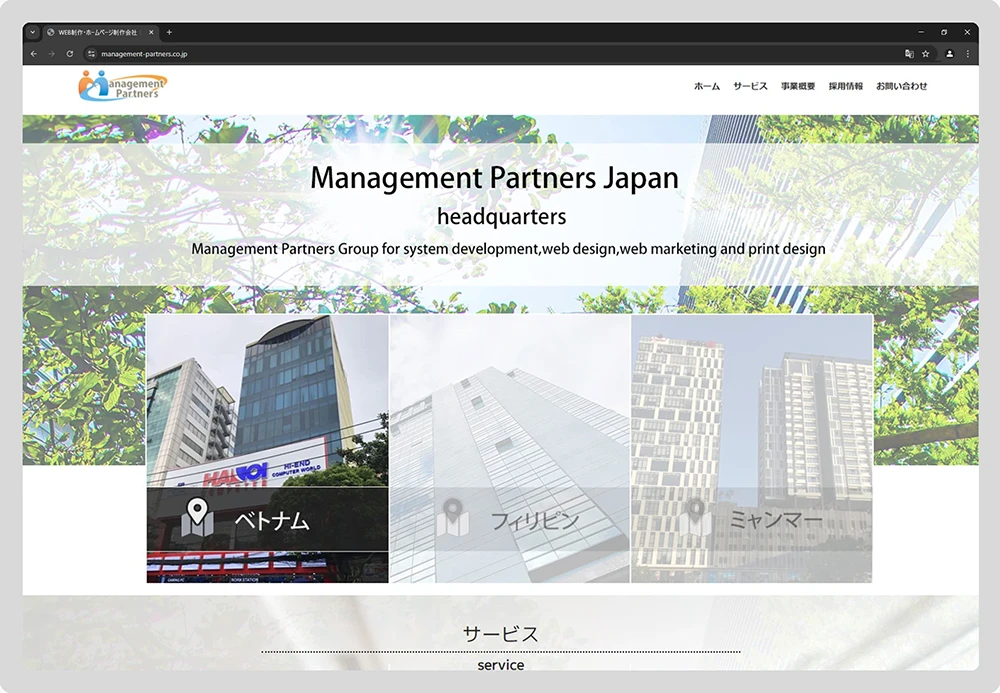
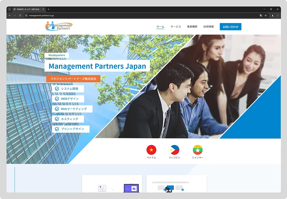
Selected wireframes showcase structural decisions that informed the final UI for key pages:
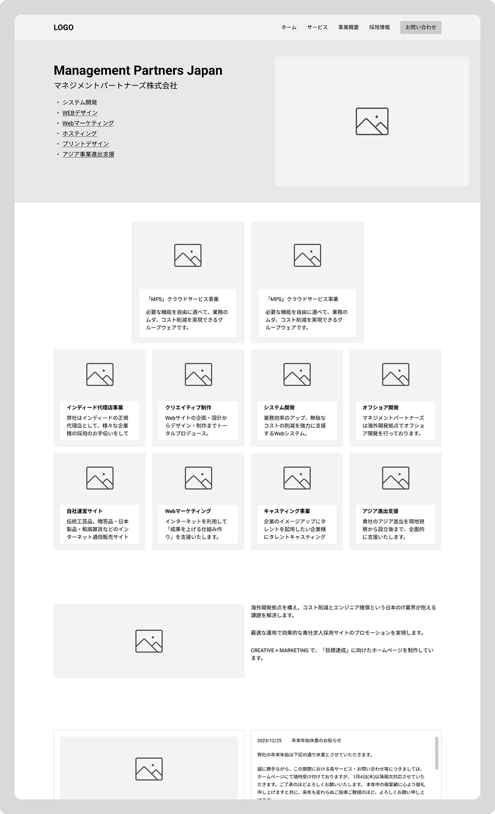
Homepage

Recruitment Information Page
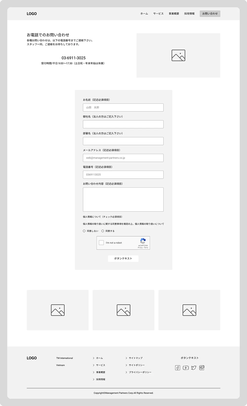
Contact Page
Homepage
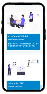
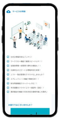
Bold hero section with direct links to expertise areas, followed by an organized services overview for fast comprehension and engagement.
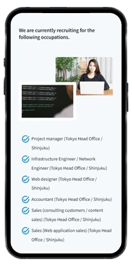
Recruitment Page
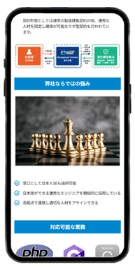
Clear presentation of job opportunities, detailing roles, requirements, and application steps to build candidate trust.
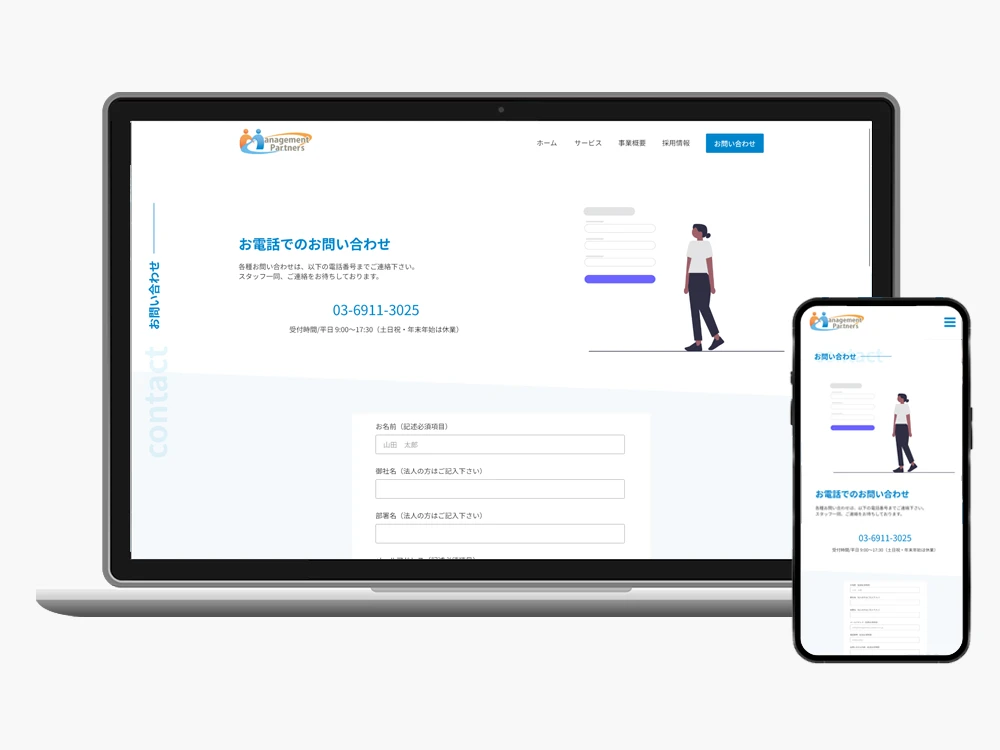
Contact Page
User-friendly, mobile-optimized inquiry form designed to encourage action at the end of the user journey.
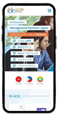
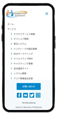
Mobile Navigation
Custom responsive navigation ensures seamless access across devices.


High-fidelity screens capture the redesign’s clean, professional tone and responsiveness across devices.
Visual Design Focus:
The final interface strengthens brand credibility and user trust while providing a seamless browsing experience that drives conversions.
This project showcased my ability to independently manage and deliver a high-quality product under tight constraints, balancing design precision with speed and stakeholder alignment.
Without formal user research, I relied on iterative design and stakeholder collaboration to validate UX decisions.
The redesign exceeded expectations, receiving positive feedback, streamlined approvals, and a clean, conversion-focused design—making it a standout example of lean UX delivery in action.
Workflow: Content mapping → Wireframing → High-fidelity design → Prototype & responsive testing → Developer handoff