Enterprise SaaS Modernization
Enterprise SaaS Modernization: Designing a Scalable Multi-Module Platform
Client: MPS
Role: Lead Product Designer (UI/UX & Visual Design)
Tools: Adobe XD, Illustrator, stakeholder feedback
Deliverables: End-to-End UI/UX Redesign, Enterprise Design System, High-Fidelity Prototypes, Developer Handoff.
Project Overview
I led the end-to-end UI/UX redesign of a complex legacy system, transforming a dated interface into a high-performing, scalable 20-module SaaS platform for global enterprise clients. As the Lead Designer, I owned the entire visual and functional overhaul—from architecting a robust Design System to ensuring seamless responsive execution across the entire software ecosystem.
The previous system suffered from significant "UI debt," featuring cluttered layouts, inconsistent components, and a fragmented user journey that hindered productivity. Collaborating closely with stakeholders, I redesigned the experience to prioritize scalability, visual clarity, and operational efficiency for high-density data environments.
Project Goals
- Modernize the Enterprise Interface: Transform a dated, "gray" legacy UI into a clean, intuitive, and professional SaaS environment.
- Establish a Scalable Design System: Develop a centralized library of reusable components and variables to support a roadmap of 20+ integrated modules.
- Streamline Complex Workflows: Simplify high-density data tasks (e.g., Payroll, HRIS, and Workforce Ops) to reduce manual errors and cognitive load.
- Ensure Visual Consistency: Maintain a unified brand identity and interaction language across all 20 modules to improve user learnability.
Design Approach
Given the massive scope of a 20-module system, I took a systematic, Design-Ops driven approach:
- Stakeholder Alignment:
I conducted deep-dive sessions with product owners to map out complex business logic and identify pain points in legacy workflows.
- Heuristic Audit & System Mapping:
I audited the existing modules to identify inconsistencies in navigation, focusing on improving the Information Architecture for enterprise functions.
- Atomic Design Implementation:
I established a centralized Adobe XD Asset Library and used Global Design Tokens for typography and colors. By utilizing Component States, I ensured the system was scalable for future features and easily adaptable for developer handoff.
Visual Transformation: Before & After
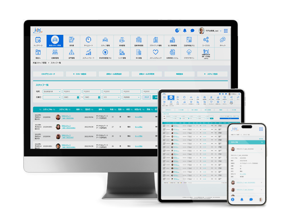
The original legacy site was overwhelmed by data density, lacking clear hierarchy and mobile accessibility.
The redesign introduced:
- Modern SaaS Aesthetics: A clean, spacious layout that guides the user’s eye toward primary actions.
- Semantic Color Logic: Used meaningful color tokens to highlight status changes, errors, and system alerts.
- Optimized Data Grids: Redesigned complex tables and forms for better readability and faster data processing.
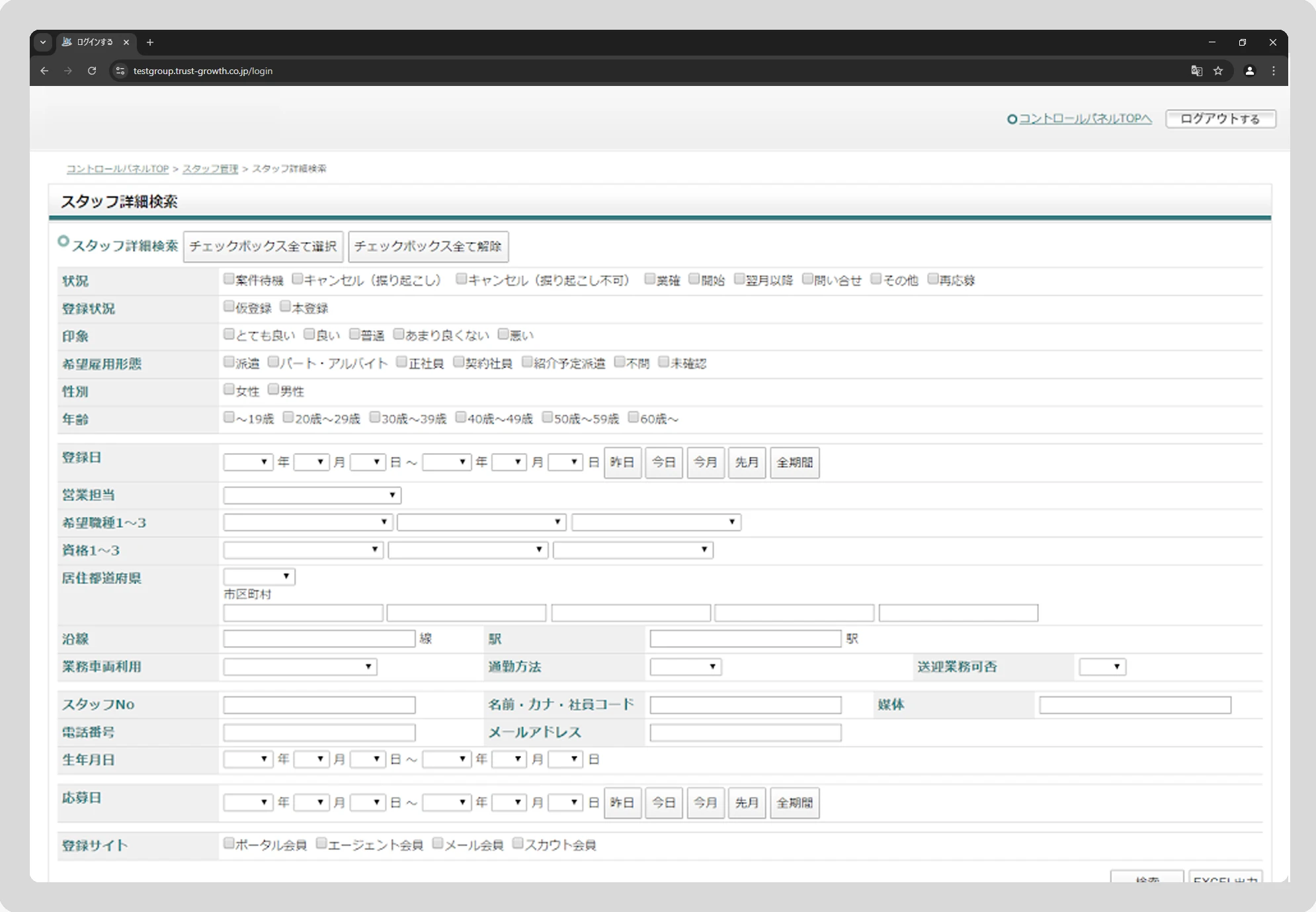
Before
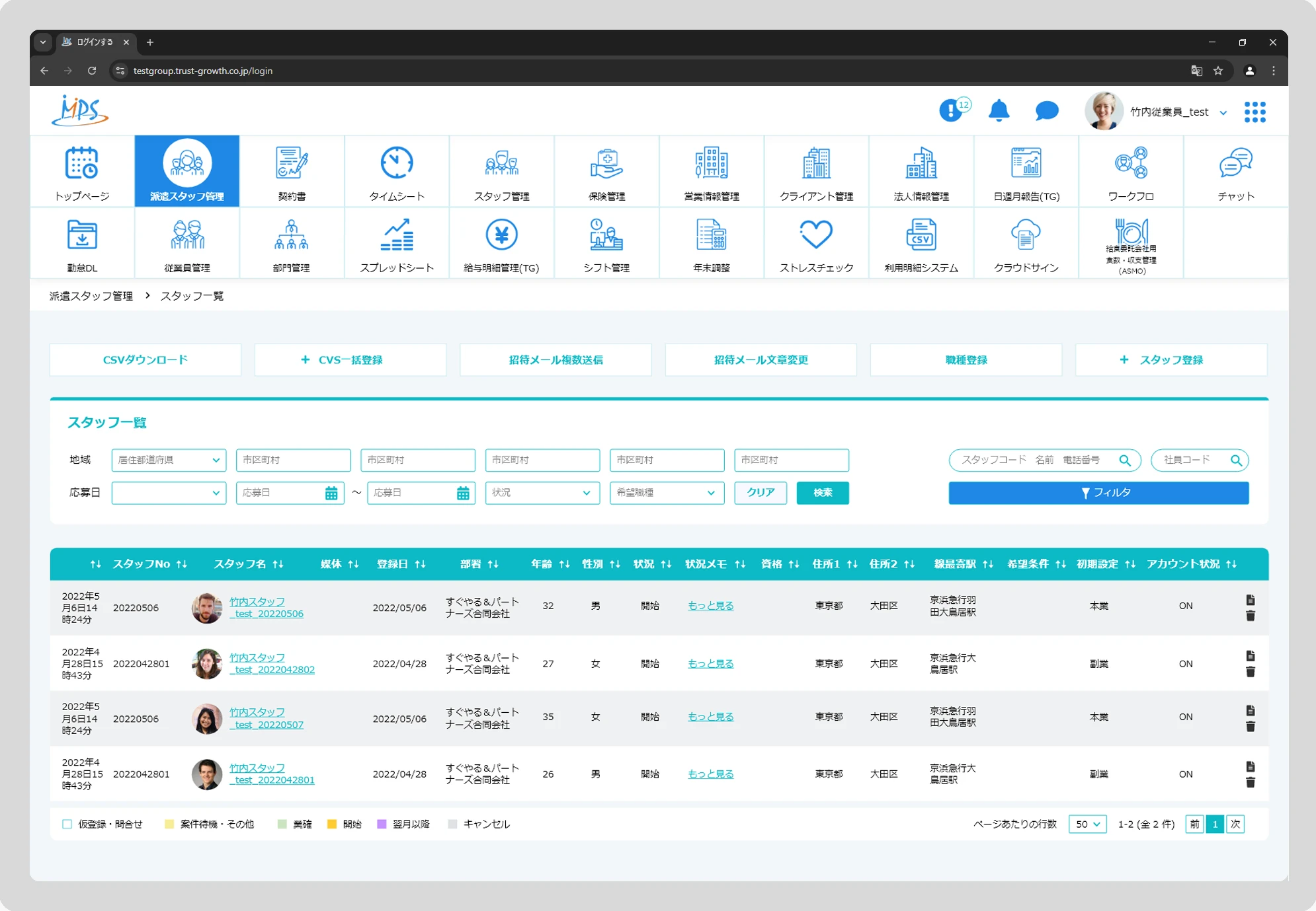
After
Wireframes & Layout Planning
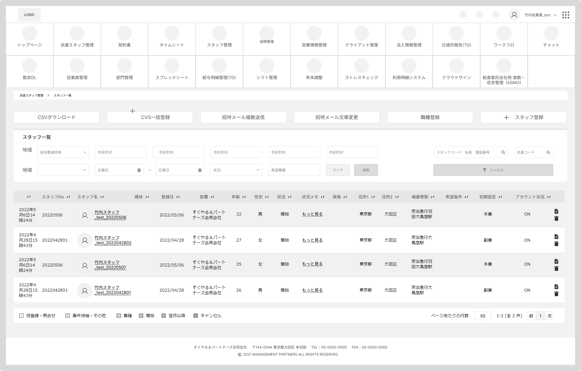
To manage high-density information like Temporary Staff Scheduling, I developed a specialized layout focused on maximizing horizontal screen space. This blueprint served as the structural foundation for the platform's data-heavy modules.
Key Structural Features:
- Adaptive Top Navigation: Designed a streamlined header for global navigation that can be collapsed to provide a full-screen 'Focus Mode' for complex data operations.
- Data-First Table Layout: Prioritized the visibility of staff records and status indicators, ensuring that admins can scan and manage large datasets with minimal visual clutter.
- Contextual User Actions: Integrated a profile dropdown for quick access to Account Settings and Admin tools, keeping the primary interface dedicated to operational tasks.
- Maximized Workspace: By allowing the navigation to be collapsed, I provided more 'real estate' for the expansive data tables required for efficient staff management and payroll processing.
This layout was part of a broader Modular Page Template strategy, ensuring that whether a user is in Staffing or Admin Settings, the core interaction patterns remain familiar and efficient.
Final UI Snapshots
The final UI reflects a sophisticated, enterprise-grade brand through:
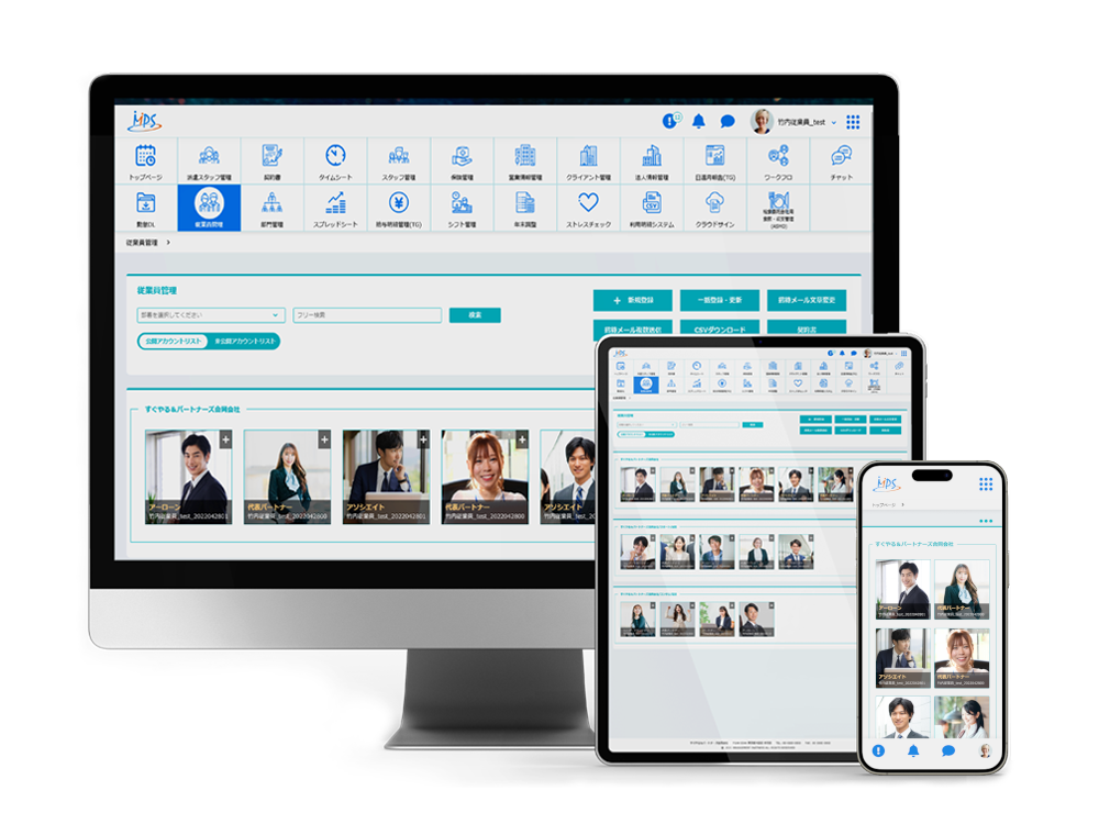
- The Command Center (Dashboard): An "at-a-glance" view featuring interactive calendars, task notifications, and communication hubs.
- Enterprise Data Management: Clean, intuitive interaction design for managing extensive employee records and administrative settings.
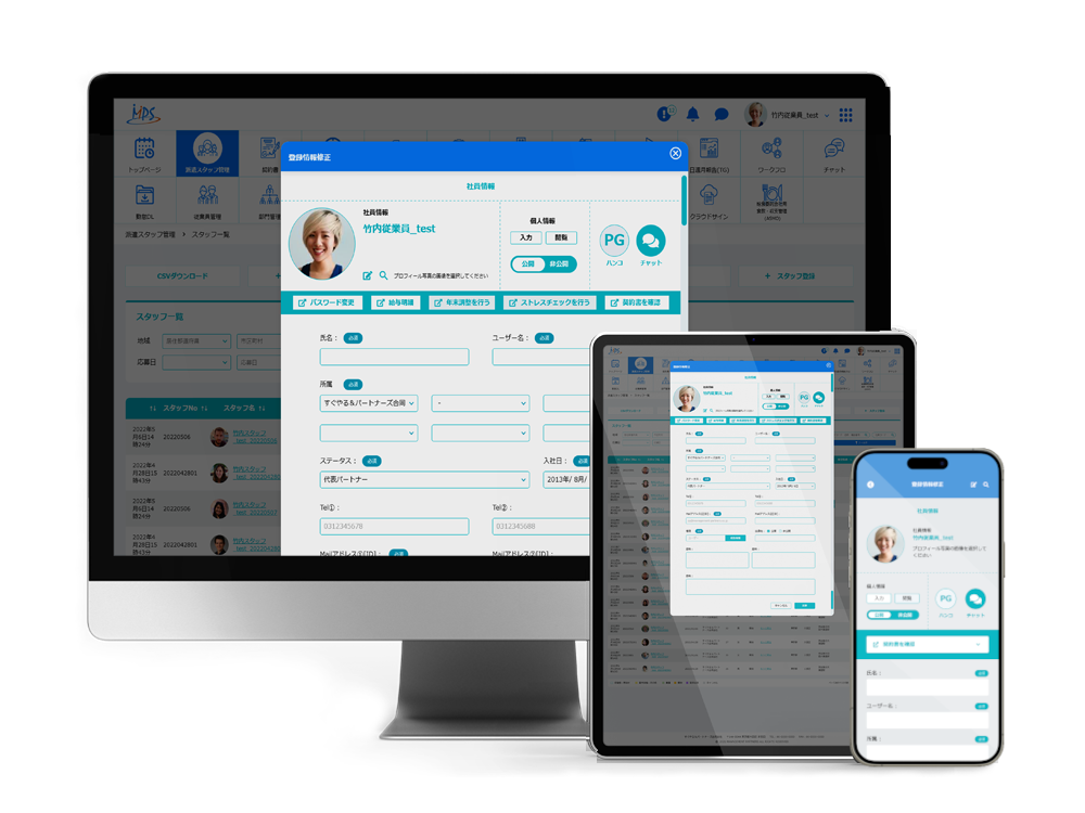
- Admin Profile Management: A streamlined interface for modifying registration details, designed with clear feedback loops and an organized layout to handle complex administrative tasks efficiently.
Outcome & Reflection
Redesigning a 20-module ecosystem from the ground up significantly strengthened my ability to design at scale. By grounding my decisions in a robust Design System and Design Tokens, I was able to deliver a solution that is not only visually polished but also technically scalable and developer-friendly.
The project highlighted the importance of Information Architecture in enterprise software—how organizing complex data can directly impact business efficiency. Leading this transformation independently boosted my expertise in managing large-scale UI/UX initiatives, and I am eager to continue applying these systems-thinking skills to complex, high-impact digital products.