
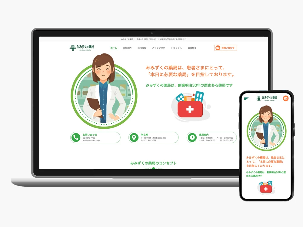
Client: みみずくの薬局
Role: Lead Web UI/UX Designer (Sole Designer)
Tools: Adobe XD, Illustrator, Photoshop, stakeholder feedback
Deliverables: Responsive Website Design (Desktop & Mobile)
I led the end-to-end redesign of a small community pharmacy’s website, modernizing its user experience, visual interface, and overall communication clarity.
As the sole designer, I managed the full process—from stakeholder alignment and UX strategy to high-fidelity UI and responsive design.
The previous website suffered from usability issues, outdated visuals, and a confusing content structure. The redesign enhanced trust, accessibility, and ease of use, particularly on mobile, while aligning with the pharmacy’s community-focused brand.
In the absence of a dedicated UX researcher, I took a lean, insights-driven approach:
Stakeholder Conversations
Conducted informal interviews with marketing team members to uncover user pain points, business priorities, and messaging goals. These insights guided the site’s structure, content hierarchy, and interaction design.
Heuristic Review
Audited the existing site using usability and accessibility principles, identifying issues such as poor readability, inconsistent buttons, and unclear page flow.
Competitive Scanning
Analyzed other pharmacy websites to benchmark modern UX/UI patterns and meet user expectations for clarity and trustworthiness.
Wireframes were created in Adobe XD to establish:
Early layouts were reviewed with stakeholders to validate flow and content placement before moving to high-fidelity design.
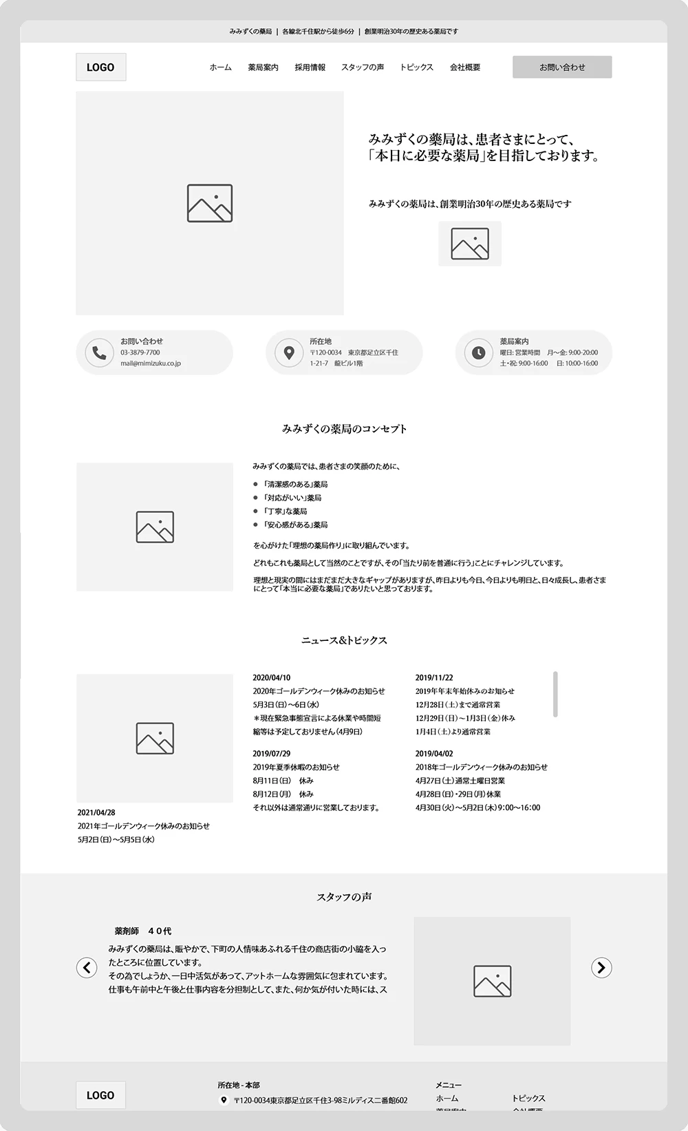
Main Entry Page
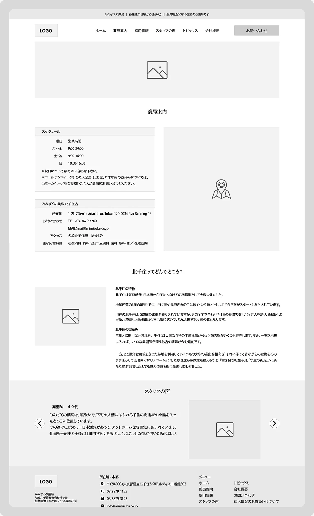
Pharmacy Info
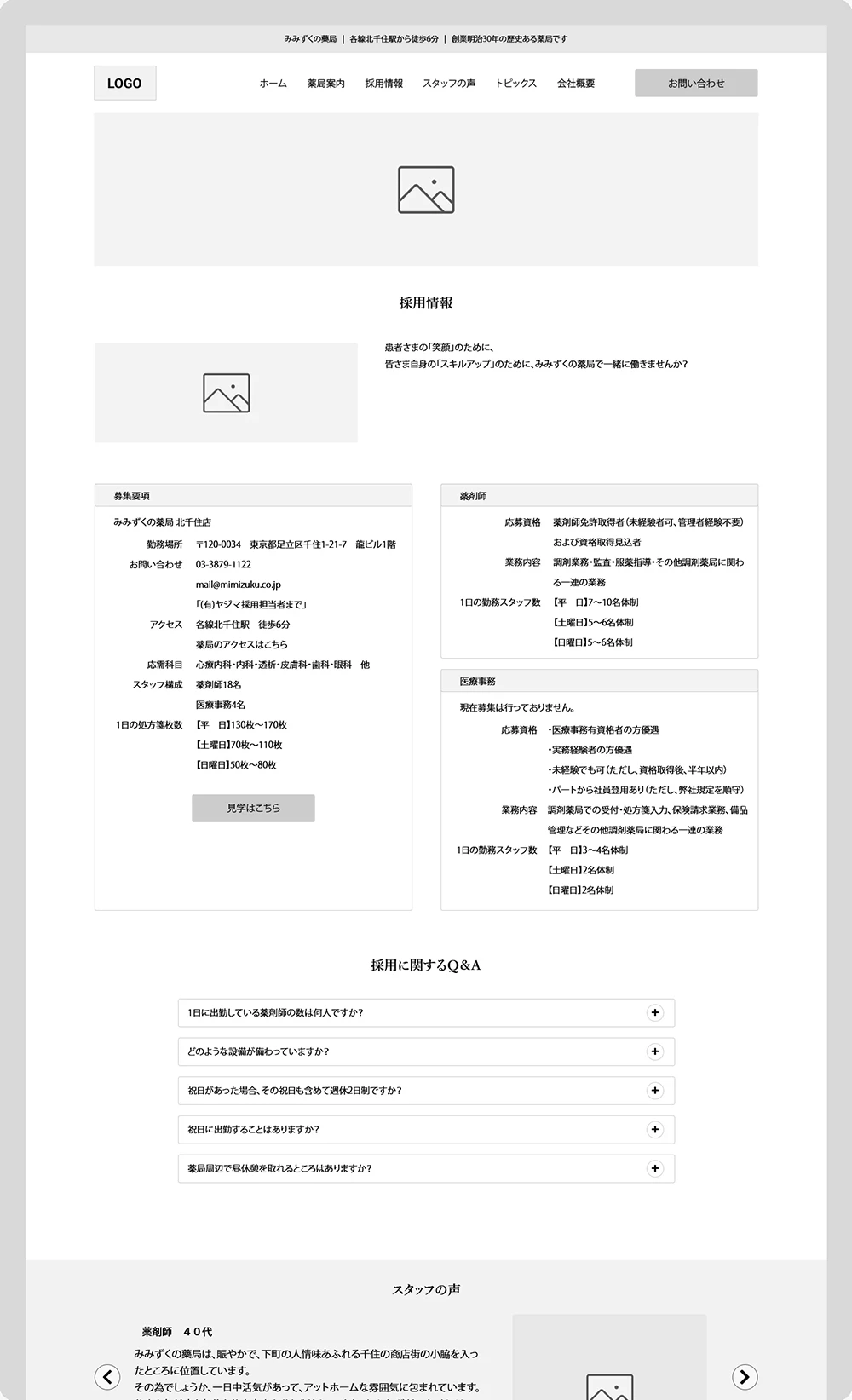
Recruitment Page
Wireframes demonstrating structure, navigation, and interaction planning
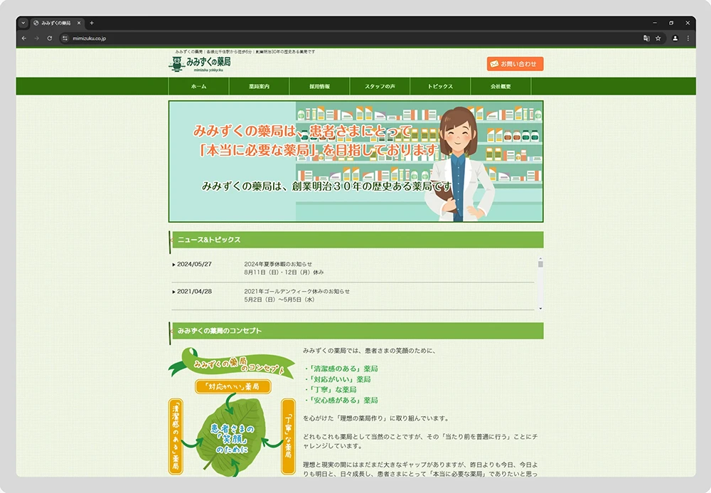
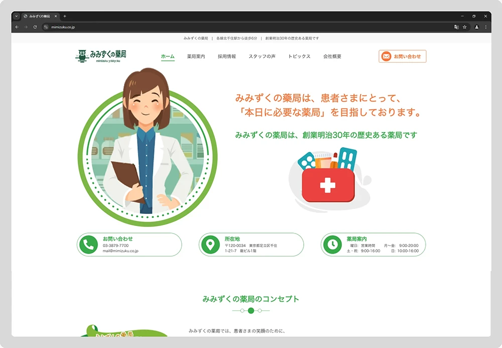
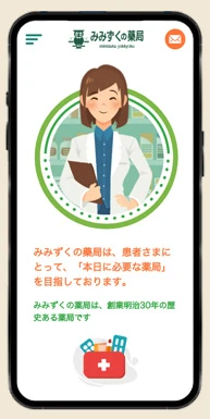
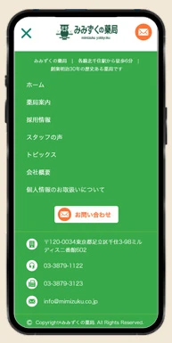
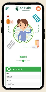
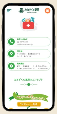
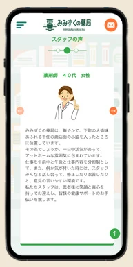
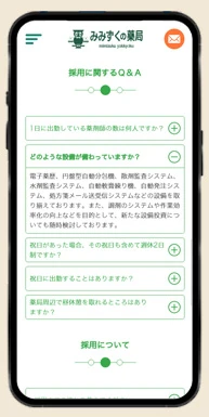
The final interface reflects the pharmacy’s caring, community-driven image through calm visuals, intuitive layouts, and accessible design patterns.
Visual Design Focus:
The UI communicates warmth and trust, balancing aesthetic appeal with practical usability — key qualities for a healthcare-related brand
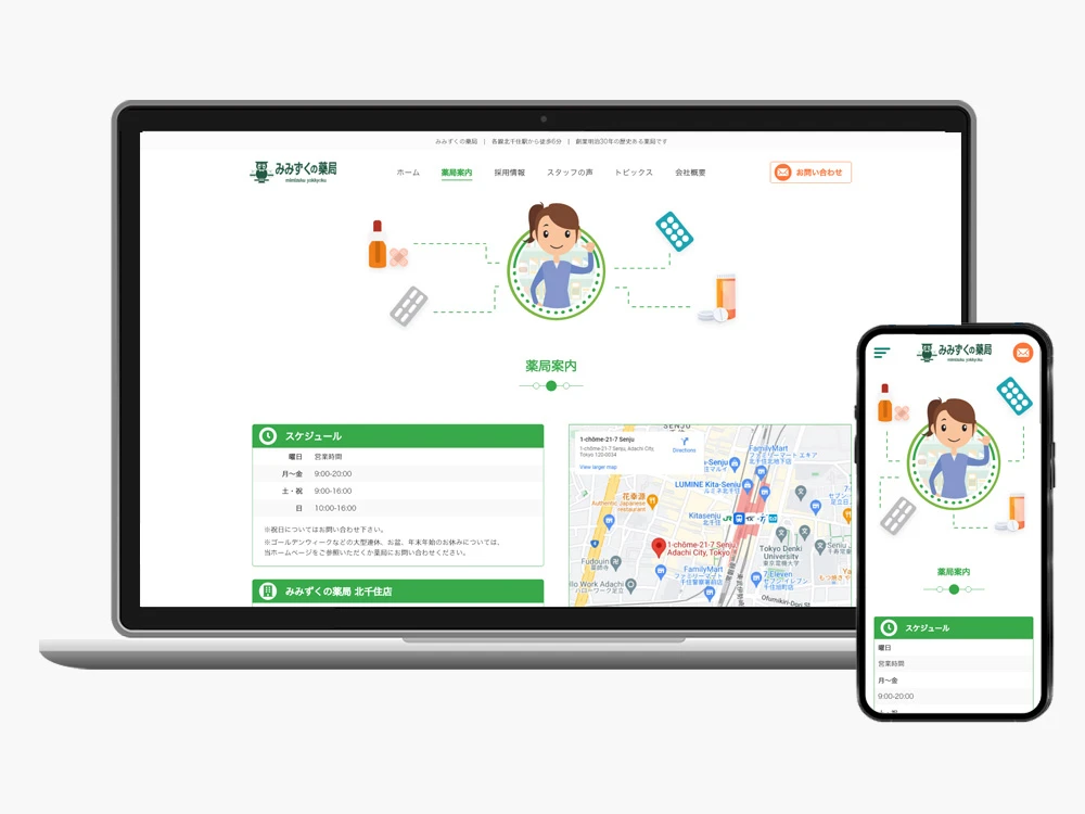
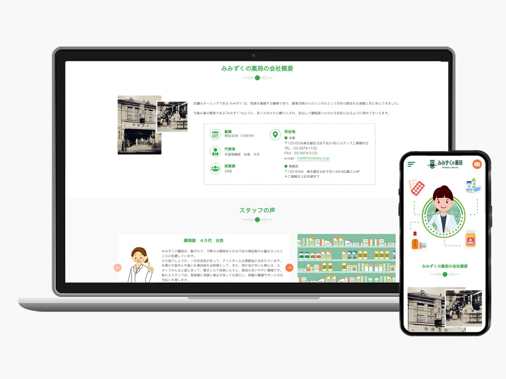
Although formal UX research wasn’t feasible, all design decisions were grounded in stakeholder conversations, heuristic evaluation, and design best practices.
The redesign delivered a user-centered, accessible, and trustworthy website, enhancing task flows such as accessing contact information or finding store details.
This project strengthened my ability to:
It also highlighted opportunities to further integrate formal UX research and usability testing in future projects.
Workflow: Stakeholder conversations → Heuristic review → Wireframing in Adobe XD → High-fidelity UI → Responsive testing → Developer handoff