
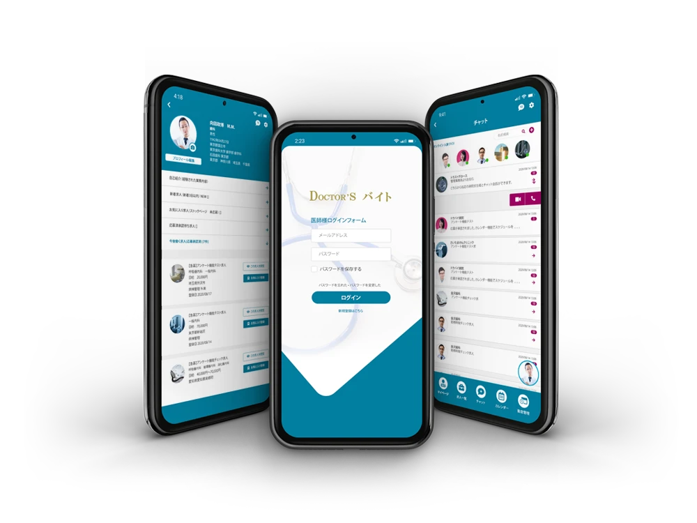
Client: Doctors バイト
Role: Lead Product Designer (UI/UX & Visual Design)
Tools: Adobe XD, Photoshop, Stakeholder Collaboration
Platform: Mobile App
Scope: End-to-end product design—from ideation and user flows to visual design and developer handoff
Doctors バイト is a mobile platform that simplifies how doctors in Japan find job opportunities, manage schedules, and communicate with hospitals. Designed for busy medical professionals, it centralizes key workflows—job listings, applications, chat, attendance tracking, and calendar management—into one seamless mobile experience.
As the sole product designer, I owned the full design process: defining flows, building wireframes, creating the final UI, and collaborating directly with developers during implementation.
The app’s goal was to provide a professional, trusted, and efficient interface that reflects the reliability of the medical field while remaining user-friendly for doctors managing their careers on the go.
Stakeholder-Driven Insights
Collaborated closely with marketing managers who provided context on user behavior and hospital-side needs. These insights revealed challenges like fragmented job listings, unclear workflows, and communication bottlenecks.
Problem-First Thinking
Each design decision was guided by core usability issues identified during discussions—specifically around application friction and delayed communication between doctors and hospitals.
Mobile-First UX
Given doctors’ mobile-first habits, the experience was designed for speed, focus, and clarity: large tap targets, minimal clutter, and logical navigation patterns across key features.
I created mid-fidelity wireframes in Adobe XD to explore layout and functionality across core user flows. These wireframes helped validate information hierarchy and interaction logic before refining the visuals.
Key Wireframe Screens:
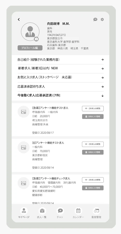
Doctor Profile

Chat Interface

Attendance Logs
Wireframes demonstrating key flows, structure, and usability planning.
The final interface was designed to inspire trust, clarity, and professionalism, with visuals reflecting the precision of the medical industry and the accessibility of a modern mobile product.
Visual Design Focus:
Highlighted Screens:

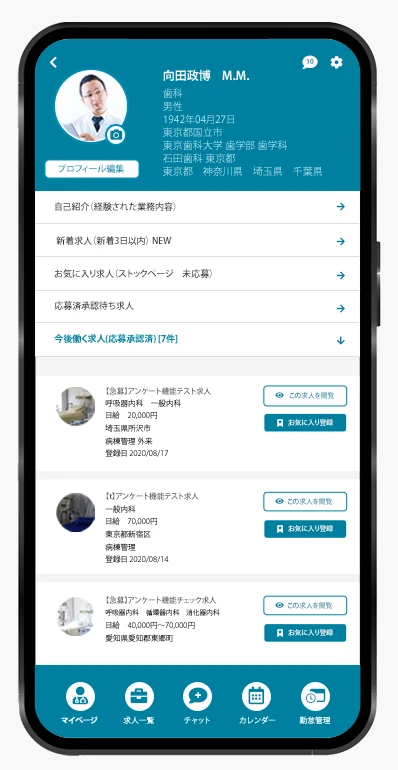

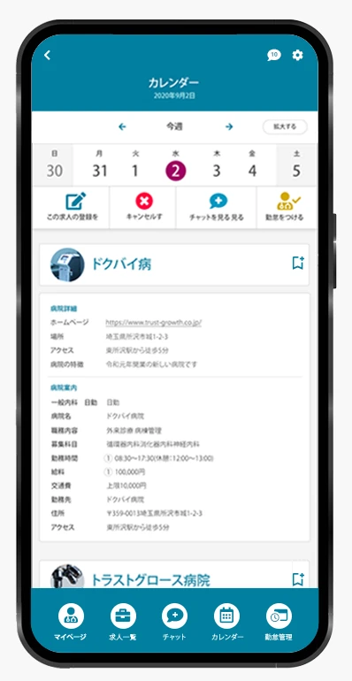
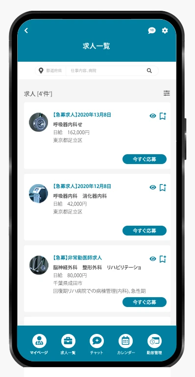

The design achieves a balance between professionalism and usability—helping doctors manage opportunities and schedules efficiently while maintaining a polished, brand-aligned aesthetic.
The final design received strong positive feedback from stakeholders for its intuitive structure, smooth navigation, and visually refined interface. Deliverables included a complete mobile design system and developer-ready assets for scalable implementation.
Collaborating closely with marketing stakeholders gave me deeper insight into user needs from a business and operations perspective. While direct interviews with doctors were not possible at this phase, stakeholder input was effectively translated into practical, user-centered solutions addressing key challenges in job search, scheduling, and communication.
Moving forward, I aim to validate these design decisions through usability testing with doctors, ensuring the app continues to evolve in alignment with real-world workflows and expectations.